Savo Volley

Let’s go, Savo!
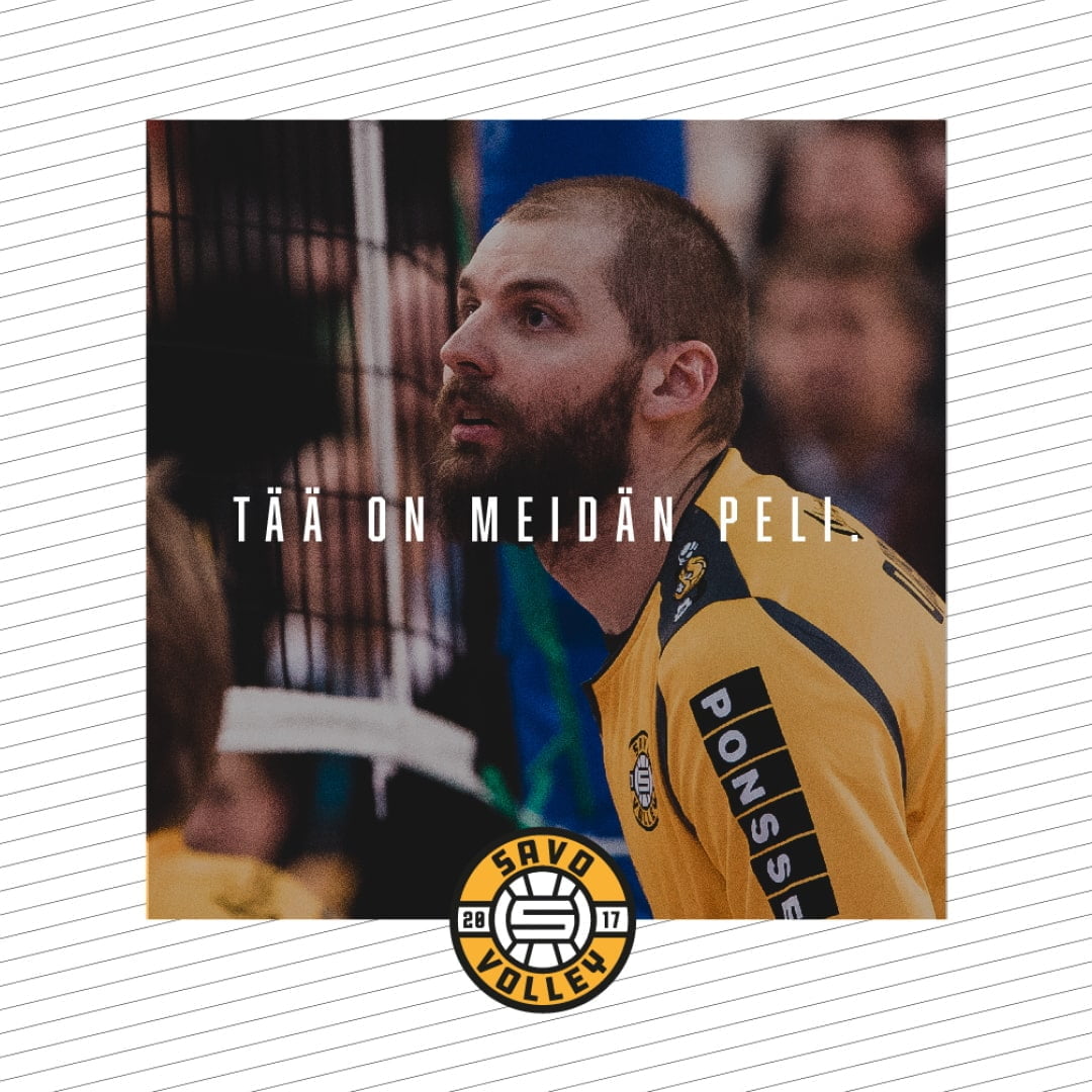
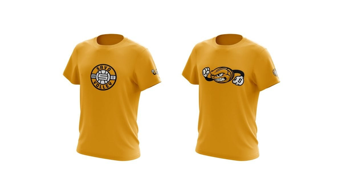
Savo Volley’s brand stands tall with its bold visual communication. The team’s colour palette includes gold, black, and white, reflecting its Savonian roots.
The emotion-evoking communication tone inspires enthusiasm and confidence, but it’s also respectful and playful. An interesting component of the messaging includes a mischievous sense of humour, embodied by the creation of the mascot Velmu.
The success of Savo Volley’s branding is evident in the team’s growing recognition. In 2018, the team won the Finnish Volleyball Federation’s award for being the volleyball phenomenon of the season. And within two years, the team became the most followed volleyball club in all of Finland.
Stars within reach, emotions running high
“We wanted to do something that no one had ever done before. We aimed so high that there was no certainty we could even reach our goals. The result changed the entire understanding of Finnish sports, showcasing what is possible to achieve when players are committed and motivated to work with the media. We knew that today, the game is more than just a game. It’s personalities, stories, and emotions.”
– Raine Siltala, former Marketing Manager of Savo Volley


Photography: Markus Aspegren, Antti Karppinen
Video Production: Lasse Hartikainen

